Gifts for Seniors: Re-Design

Gifts for Seniors: Re-Design

Gifts for Seniors: Re-Design

Project Description:

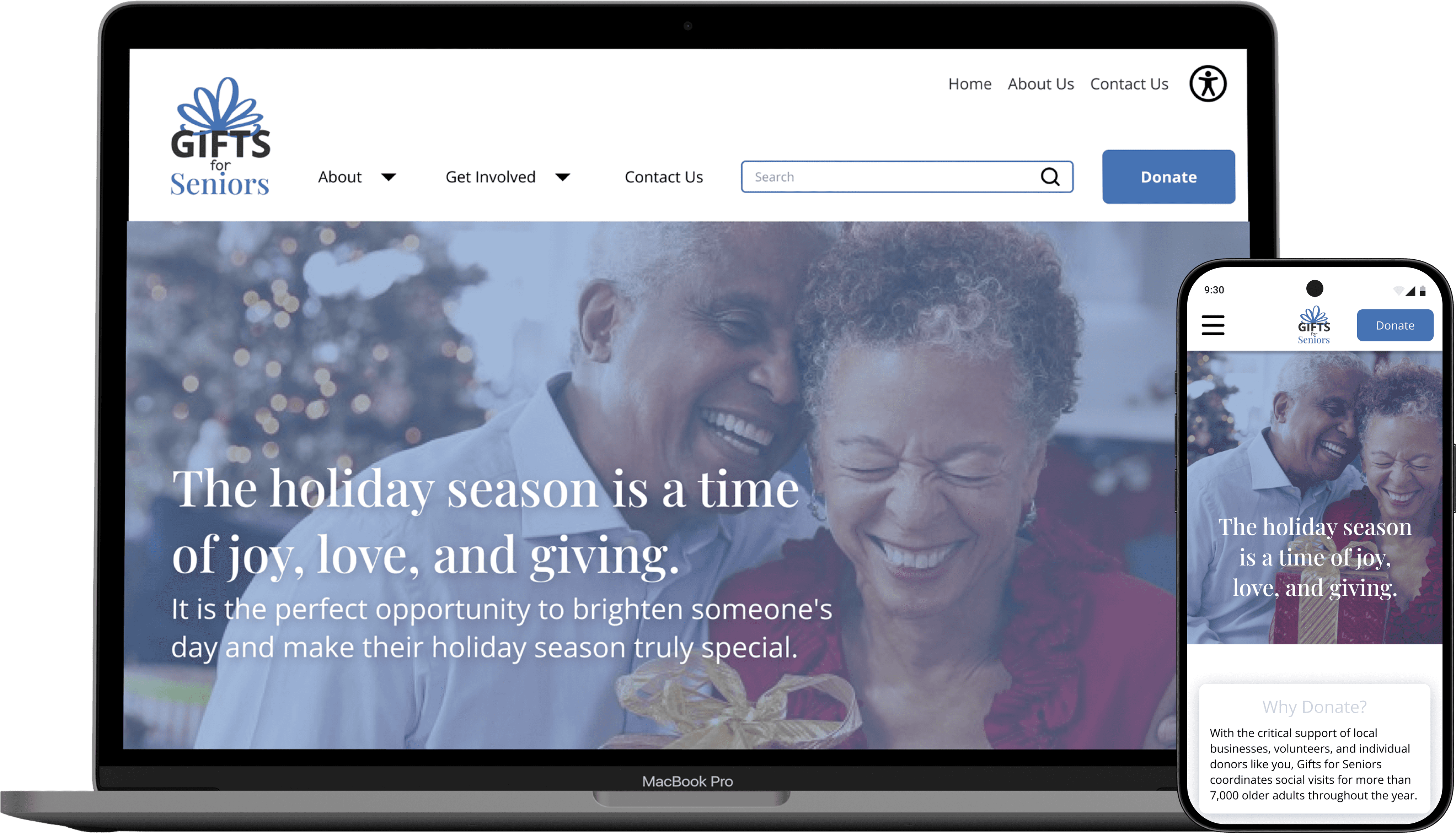
Redesign local non-profit Gifts for Senior’s website and make it easier for users to learn about the organization’s mission, more intuitive to navigate, and easier to get involved.

Timeline:

September 2023

Tools:

Figma

Pinterest

Giphy

Google Fonts

Google Drive

Slack

Tools:

Figma, Pinterest, Giphy, Google Fonts, Google Drive, Slack

Background: Gifts for Seniors is a non-profit organization in Minneapolis, MN. They provide donated gifts to isolated seniors. These critical donations come from individuals, corporate sponsors, volunteers, and community partnerships. Over time, it has become more difficult for individuals to make an impact in their communities. The updated website aims to facilitate more non-profit engagement, volunteerism, and increase the level of impact that Gifts for Seniors can have through more donations.


My Impact: My focus was leaning into stakeholder communication with the organization’s Executive Director, UI Design & Component library development, as well as overall team project management. I also wrote key UX insights and spearheaded implementation of UI Design with a Design System taking into account design pivots and iterations along the way. I helped share our probono work to the Executive Director, who as a result implemented some of our work into the newly updated website. Check out the website here!

How might we clarify the mission and define more clearly the ways people can contribute to and partner with Gifts for Seniors in order to achieve more donations and involvement for the cause?

How might we clarify the mission and define more clearly the ways people can contribute to and partner with Gifts for Seniors in order to achieve more donations and involvement for the cause?

View prototype!

Design Process

RESEARCH & DEFINE

Who is the User?

First I needed to discover what was working and what was not currently working for Gifts for Seniors users. Key tactics included a heuristic evaluation, user interviews, a survey, initial website usability tests, affinity mapping, and a competitive analysis.

08

08

09

04

05

07

03

02

02

01

06

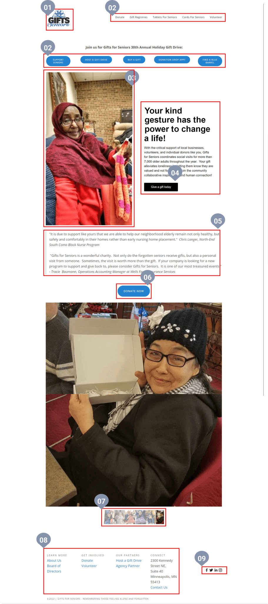
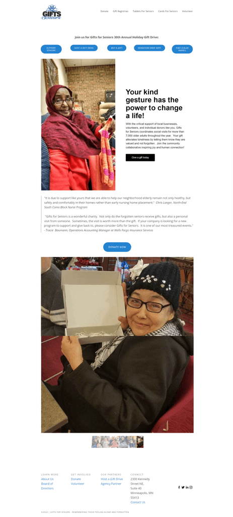
Usability Heuristics

01

Logo: Mindful color and typography choice representing the gifting brand identity

Logo: Mindful color and typography choice representing the gifting brand identity

02

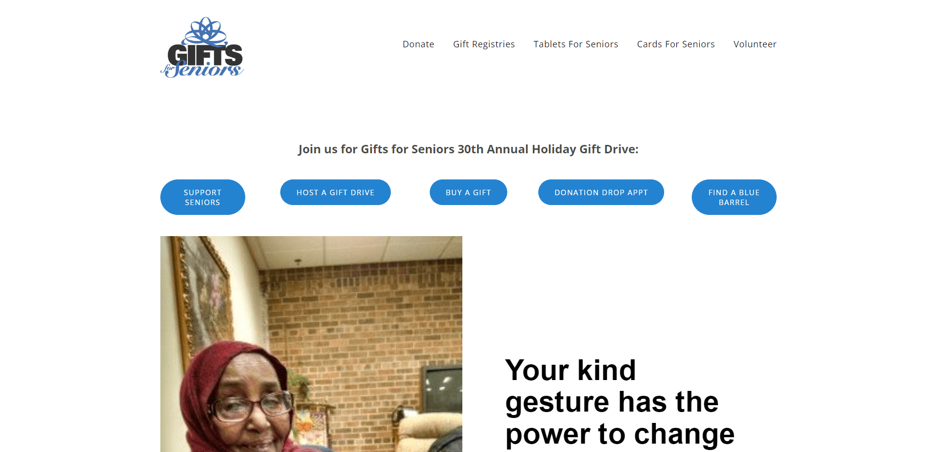
Nav Bar: Lacking guidance for user - chunking categories

03

Hero Image: Reflects organization mission - could be larger and higher quality

Hero Image: Reflects organization mission - could be larger and higher quality

04

Call to Action: Highlights mission and emotional appeal - button does not match design system (color, radius)

Call to Action: Highlights mission and emotional appeal - button does not match design system (color, radius)

05

Testimonials: Great personal connection and meaning that could be emphasized larger on the page

06

Donate Button: Focal point

07

Image Carousel: Opportunity to showcase more high quality images for user to connect to

08

Footer: Duplicative links, category chunking to guide the user

09

Social Media Links: Positioning could be placed within footer content

Social Media Links: Positioning could be placed within footer content

When it comes down to business, figuring out how to best position the organization with the intent of attracting (and retaining) various different user segments became a hurdle.

When it comes down to business, figuring out how to best position the organization with the intent of attracting (and retaining) various different user segments became a hurdle.

Users surprised us!

To gather qualitative and quantitative research, we conducted 5 interviews and preliminary usability tests.

Methodology:

Participants were interviewed with the goal of understanding the frustrations that they may encounter with how and where to give back to their communities. They were also given tasks to click through the site.

A quick survey

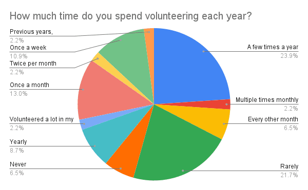
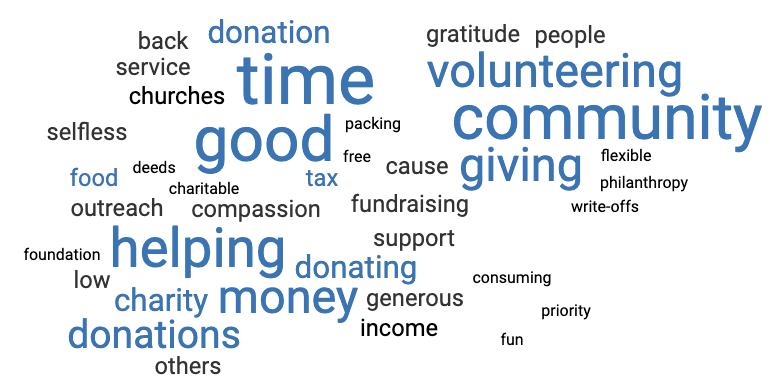
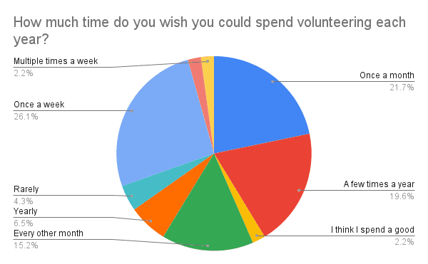
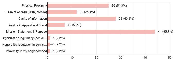
To further support our user insights, I crafted a survey to learn why users choose to invest their time and money into certain organizations and received 46 responses. Survey questions were centered around volunteer involvement, interest, constraints, and feelings.

71% of respondents said they want to volunteer more frequently than they do currently - How might Gifts for Seniors cross that threshold by tapping into a more mission-focused lens and users’ positive emotions towards giving back to the community?

71% of respondents said they want to volunteer more frequently than they do currently - How might Gifts for Seniors cross that threshold by tapping into a more mission-focused lens and users’ positive emotions towards giving back to the community?

“What words come to mind when you think of volunteering?”

“What words come to mind when you think of volunteering?”

“What is most important for you when deciding whether or not to get involved with a non-profit organization?”

“What is most important for you when deciding whether or not to get involved with a non-profit organization?”

User Insights

Constraints

“It’s hard to figure out where to start - there are so many good causes so it’s hard to pick one”


Feels Good to Give Back

“I enjoy volunteering to give back to my community and meet new people”

Reasons for Volunteering

“I prefer to volunteer rather than donate because I like to physically make a difference/change in my community”

Methods to Get Involved

“I find organizations through friends’ recommendations and don’t feel the need to research these much because of trust”

Constraints

“It’s hard to figure out where to start - there are so many good causes so it’s hard to pick one”


Feels Good to Give Back

“I enjoy volunteering to give back to my community and meet new people”

Reasons for Volunteering

“I prefer to volunteer rather than donate because I like to physically make a difference/change in my community”

Methods to Get Involved

Methods to Get Involved

“I find organizations through friends’ recommendations and don’t feel the need to research these much because of trust”

Challenge:

How might Gifts for Seniors drive more donations through the website and effectively inform the user on their mission?

How might Gifts for Seniors drive more donations through the website and effectively inform the user on their mission?

IDEATE

Brainstorming

After conducting a thorough analysis of Gifts for Seniors’ current state, user research, and the competitive landscape, I developed a Problem Statement defining the overarching pain points for users:


We believe that clarifying the mission and better defining the ways people can contribute to and partner with Gifts for Seniors will achieve more donations and involvement for the cause.


Before beginning solutioning, we utilized a few brainstorming tactics such as Affinity Mapping, I Like I Wish What If, and a Feature Prioritization Matrix in order to consolidate our user insights and prioritize which features to focus on for our redesign.

There were 6 features that stood out to us as top priorities to implement within the website redesign that were feasible, realistic and actionable.

Bringing it back to the user

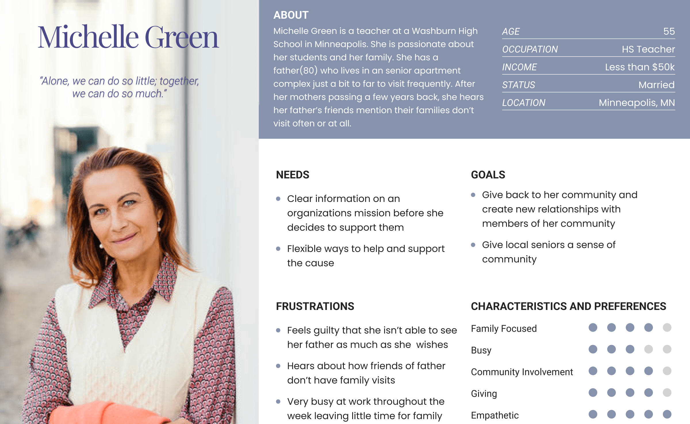
Next I created a User Persona to better empathize and relate to her goals and limitations - Michelle Green was born.

Michelle needs to find easier ways to get involved with her community because she only gets involved with organizations that she can trust on a personal level.

Michelle needs to find easier ways to get involved with her community because she only gets involved with organizations that she can trust on a personal level.

Defining the user journey

Defining the user journey

User Scenario

Michelle is visiting her father at his senior living facility this weekend. Throughout her visit, she notices how isolated the other seniors are. She also hears from her father that they don’t get many visitors and can often feel lonely and forgotten at times. As she chats with a nurses aid, she hears about Gifts for Seniors, an organization that is aiming to address this issue by coordinating social events as well as donations as a way to alleviate the senior’s loneliness and remind them they are valued and not forgotten. Upon hearing about this mission, Michelle decides she wants to help.

Goals

Learn more about Gifts for Seniors and how she can help

Give back to her community and create new relationships with members of her community

Give local seniors a sense of community

Provide a solution to the social isolation and loneliness many seniors face

Empower and educate her students in her classes about needs in the community and ways they can help

  • Learn more about Gifts for Seniors and how she can help

  • Give back to her community and create new relationships with members of her community

  • Give local seniors a sense of community

  • Provide a solution to the social isolation and loneliness many seniors face

  • Empower and educate her students in her classes about needs in the community and ways they can help

Scenario Phases

Michelle visits her father at his senior living facility

She notices how isolated the seniors are and hears about how lonely they often feel

Upon chatting with a nurses aid, she hears about Gifts for Seniors and decides to learn more to help in any way she can.

Michelle logs on to Gifts for Seniors and learns more about all the ways she can help her local senior community

SYNTHESIZE

Putting together user feedback and insights, I began ideating for solutions.

Information Architecture

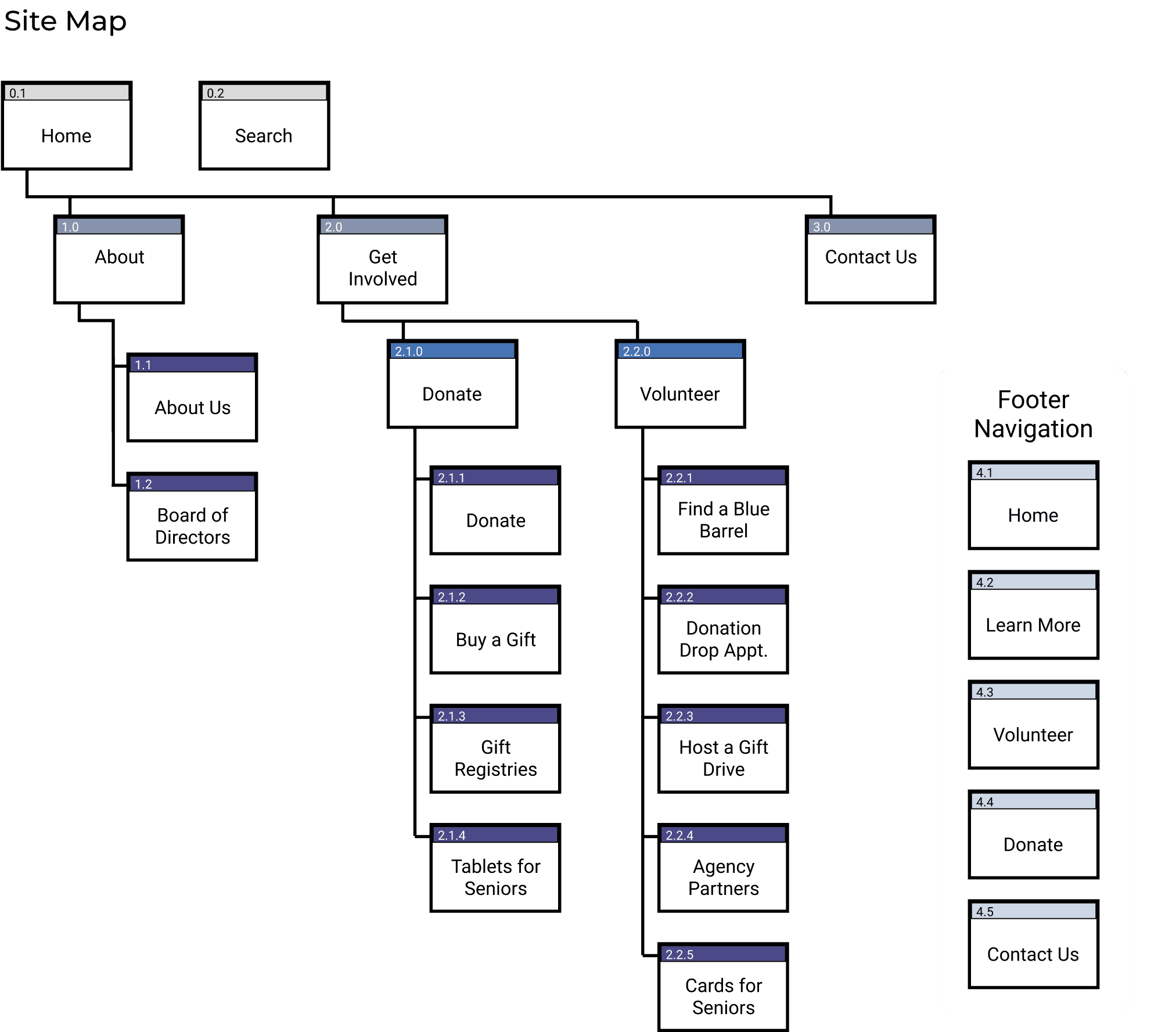
With navigation being a key opportunity from initial research, the team focused heavily on how to best rebuild the Gifts for Seniors Information Architecture (IA) to more intuitively display content and lower the barrier to entry for new volunteers.


Because our user Michelle needs a way to more easily find how to get involved with Gifts for Seniors, the group crafted a new navigation system and UX copy within the Primary Navigation Bar to illustrate the breakdown between donation-based activities and volunteer-based activities.

PROTOTYPE & TEST

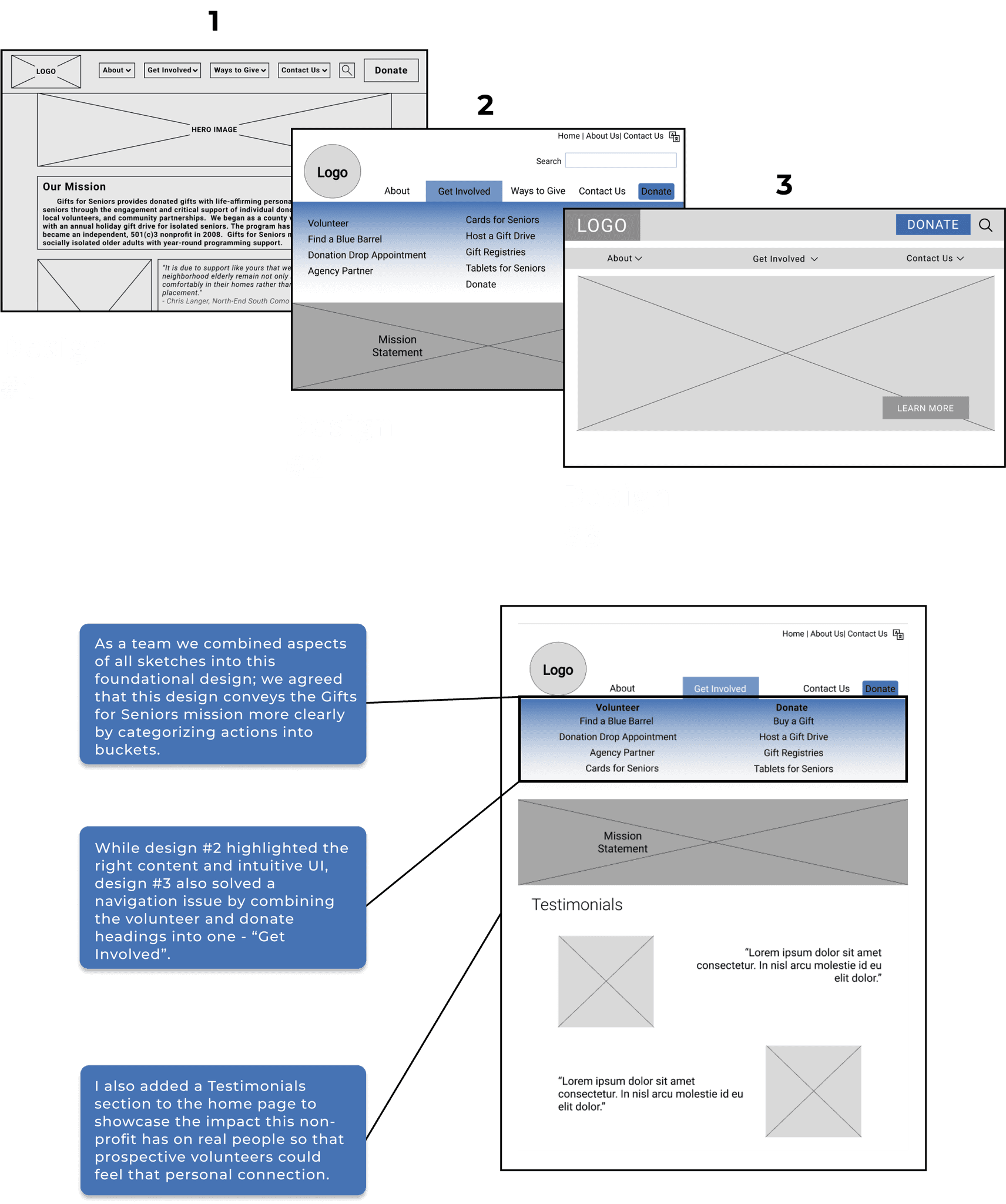
Low-Fi & Mid-Fi Wireframe Sketches

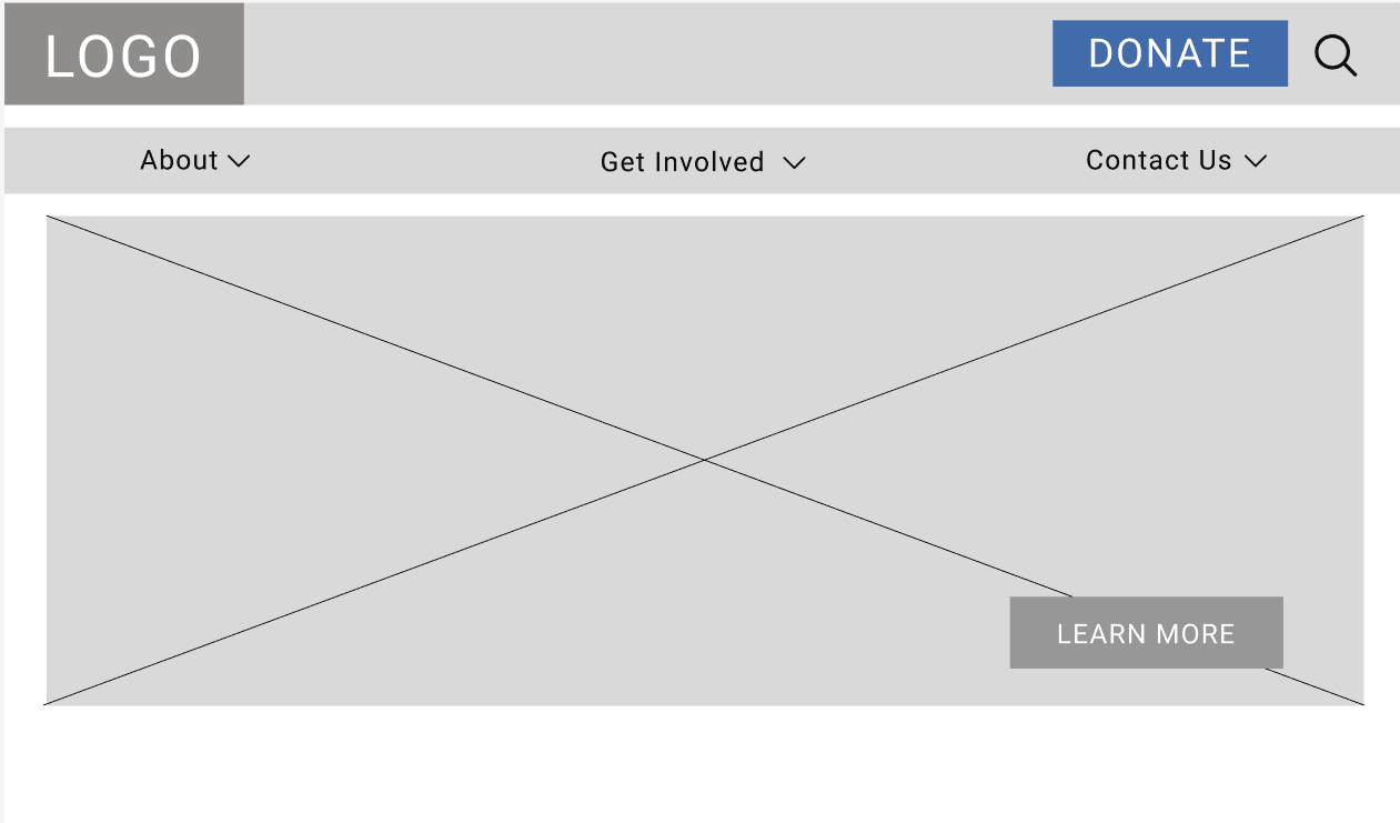
After defining the user task flow and site architecture, we created the first set of low-fi wireframes taking into account our key user insights thus far. 

1

Design #1

2

Design #2

3

Design #3

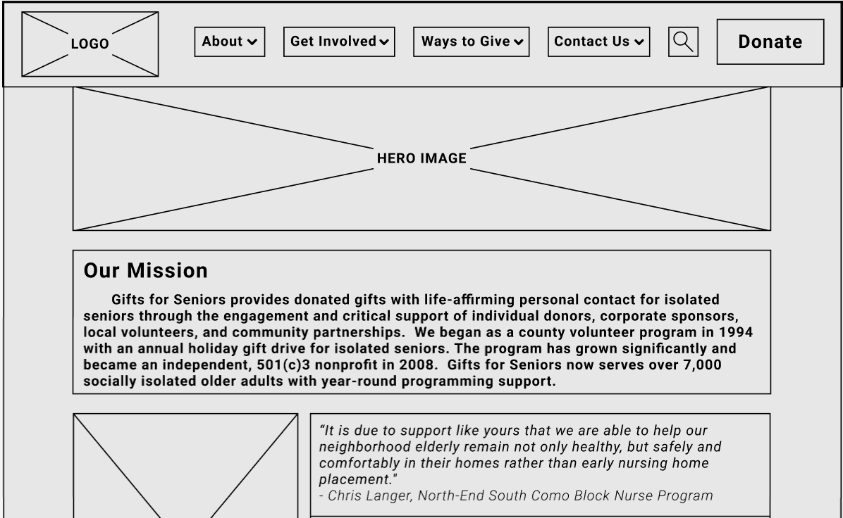
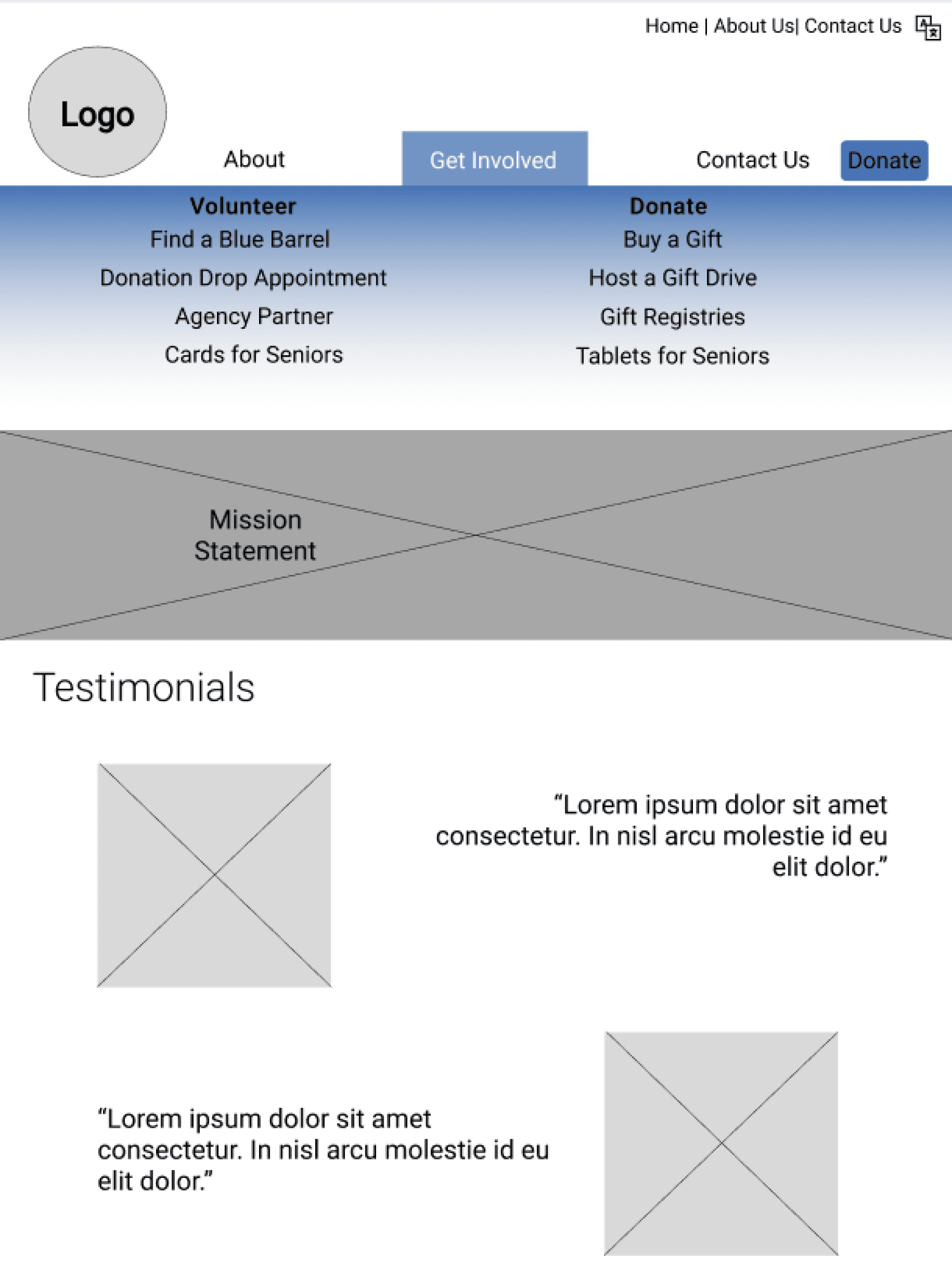
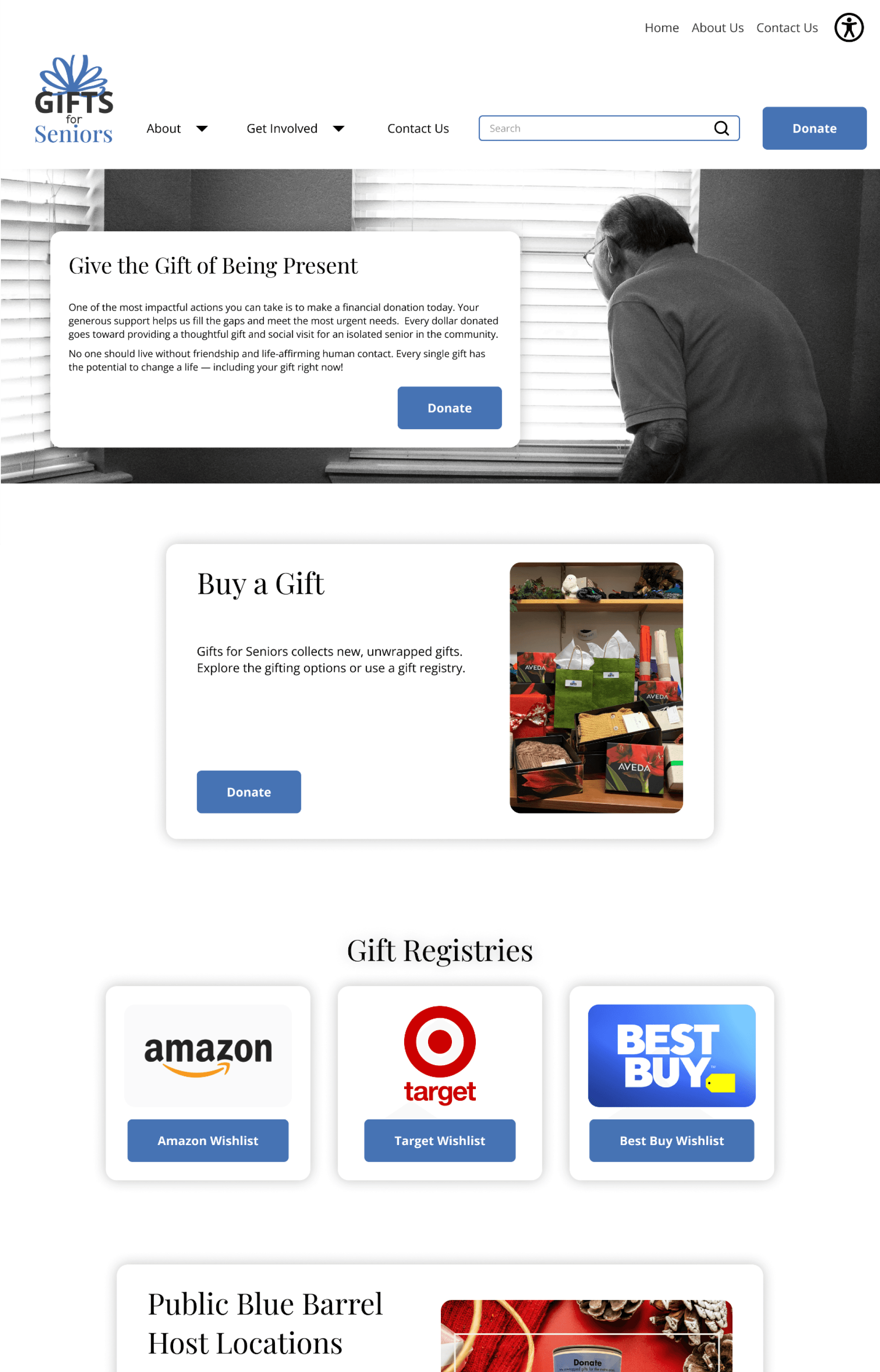
As a team we combined aspects of all sketches into this foundational design; we agreed that this design conveys the Gifts for Seniors mission more clearly by categorizing actions into buckets.

While design #2 highlighted the right content and intuitive UI, design #3 also solved a navigation issue by combining the volunteer and donate headings into one - “Get Involved”.

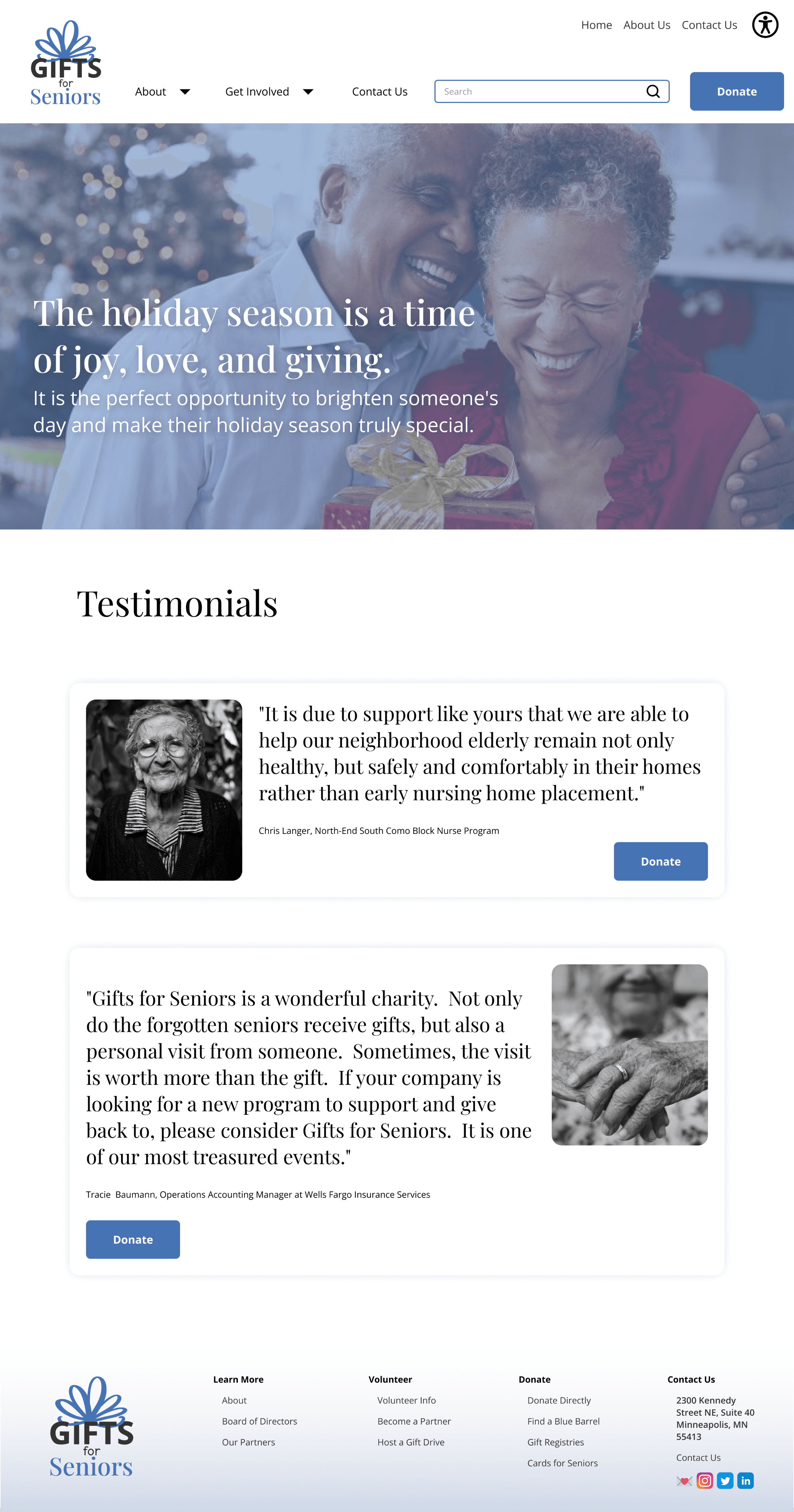
I also added a Testimonials section to the home page to showcase the impact this non-profit has on real people so that prospective volunteers could feel that personal connection.

Double-Checking The Work

Five total mid-fidelity usability tests (three mobile and two desktop) were conducted to gather qualitative data from users. Data was consolidated using FigJam and then placed into a Feature Prioritization Matrix to better visualize what iterations needed to be made.


Tasks:

  1. Go about making a monetary donation

  2. Become an Agency Partner

  3. Find how to participate in Cards for Seniors

7 features stood out to us as top priorities to implement as we move towards a hi-fi prototype:


Apply style guide

Intuitive way back to homepage

Hover states

Adjust white space

Consistent style to social icons

Adjust spacing, sizing and alignment of the footer

7 features stood out to us as top priorities to implement as we move towards a hi-fi prototype:


  • Apply style guide

  • Intuitive way back to homepage

  • Hover states

  • Adjust white space

  • Consistent style to social icons

  • Adjust spacing, sizing and alignment of the footer

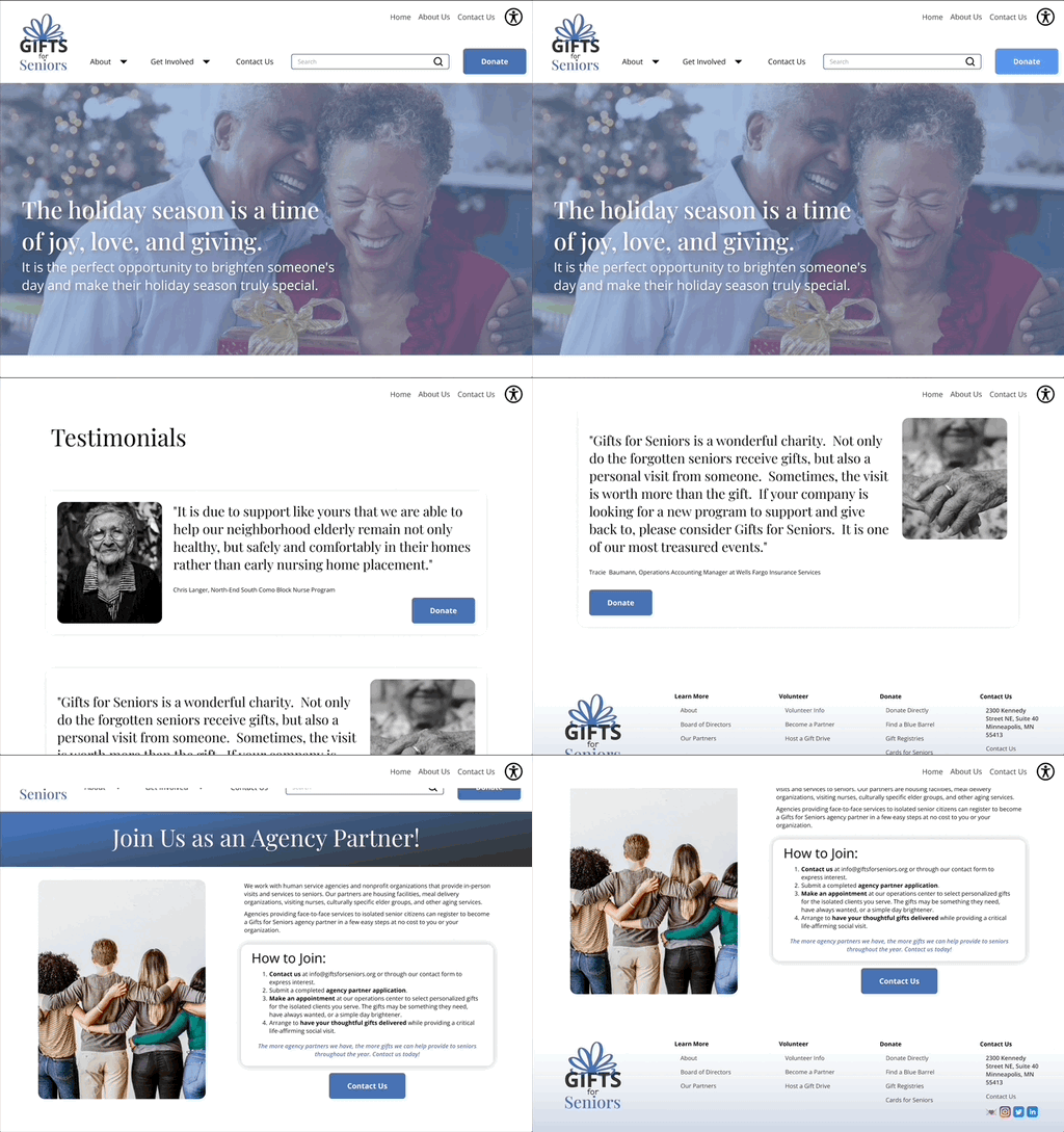
Key Iterations From Testing


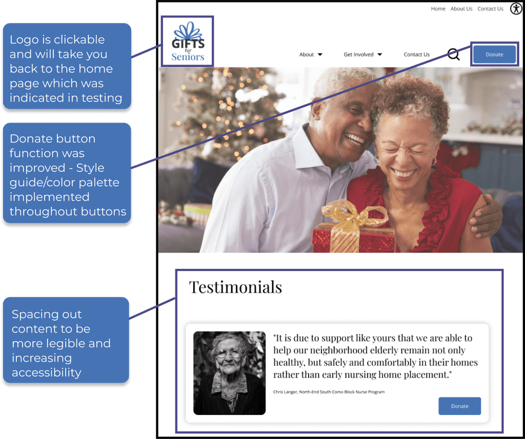
Spacing out content to be more legible and increasing accessibility

Donate button function was improved - Style guide/color palette implemented throughout buttons

Logo is clickable and will take you back to the home page which was indicated in testing

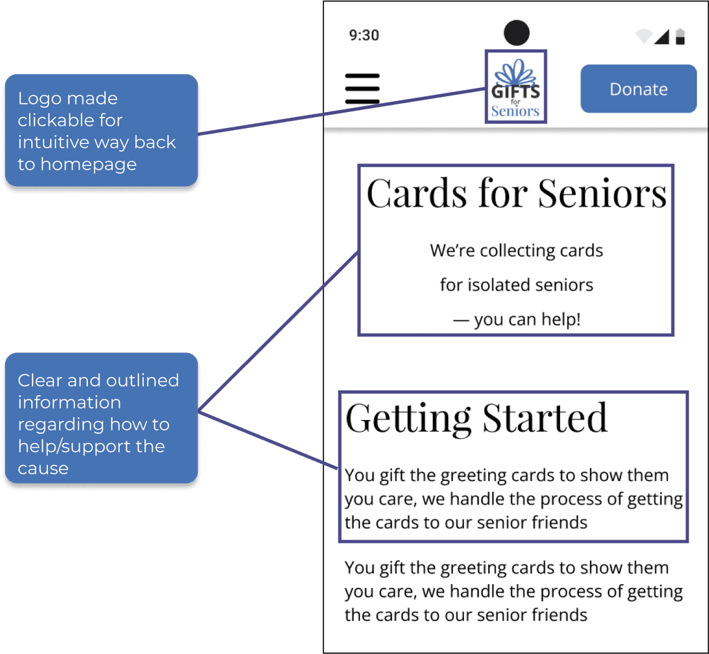
Clear and outlined information regarding how to help/support the cause

Logo made clickable for intuitive way back to homepage

Putting the UI Together

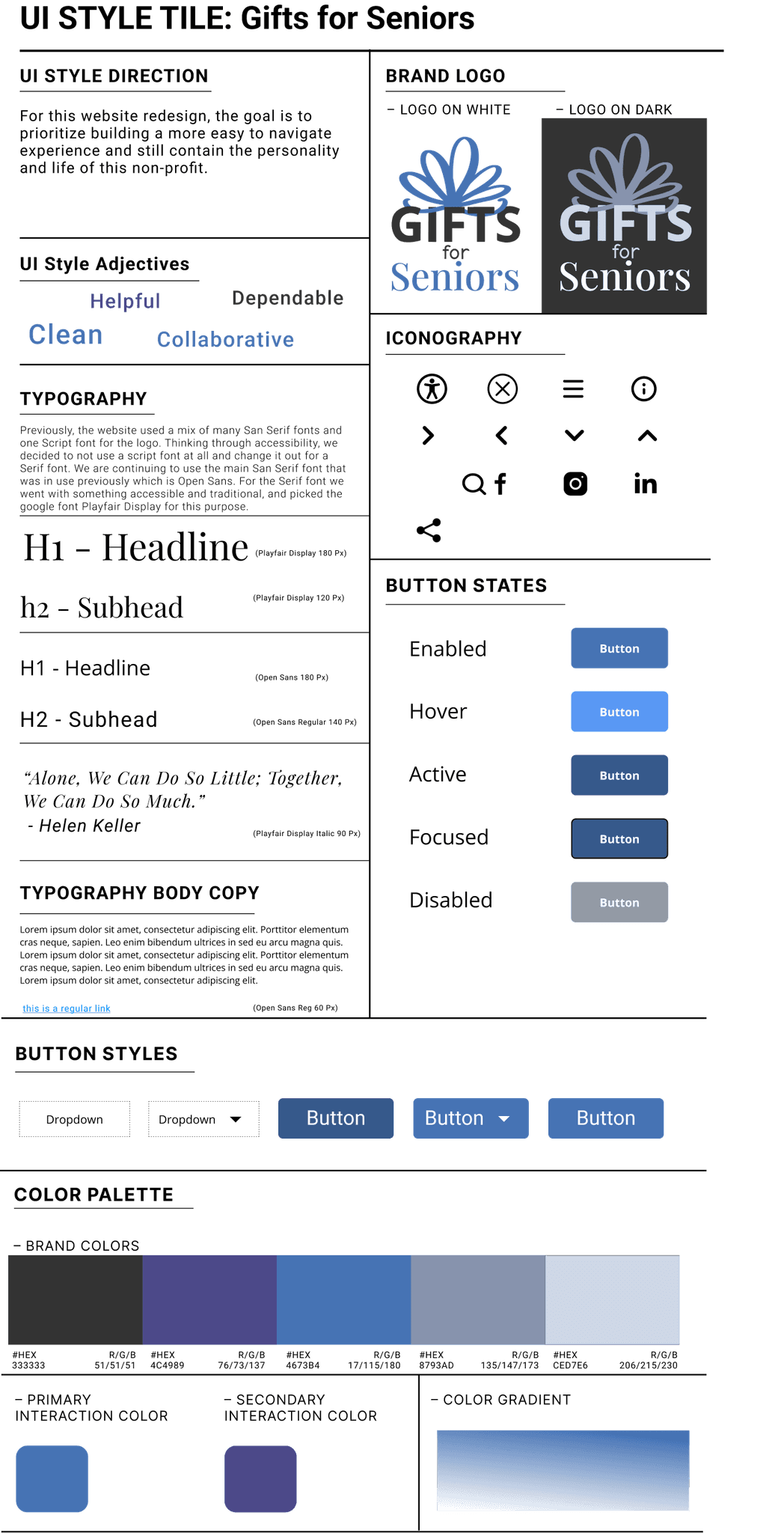
As the team continued to apply iterations to our designs, I focused on constructing components and reusable elements to make designing and iterating more efficient. I developed a thorough Component Library, and coupled with the team’s UI Style Tile helped bring personality and cohesiveness into the designs.


Collaborating with our illustrator who created the newly-imagined color theory and logo branding, I kept in mind our users’ needs for a more approachable, easy-to-use, and informational tone throughout the new website.

Button StYLEs

Dropdown

Dropdown

Button

Button

Button

Image Samples

GRaphic Patterns

– Color Gradient

Color Palette

– Primary
Interaction Color

#hex

8793AD

R/G/B

135/147/173

#hex

CED7E6

R/G/B

206/215/230


#hex

4673B4

R/G/B

17/115/180

#hex

4C4989

R/G/B

76/73/137


#hex

333333

R/G/B

51/51/51

– Secondary

Interaction Color

– Brand Colors

Button States

Button

Button

Button

Button

Button

Enabled

Hover

Active

Focused

Disabled

Iconography

Brand Logo

– Logo on White

– Logo on Dark

Typography

Typography Body Copy

H1 - Headline

H1 - Headline

h2 - Subhead

h2 - Subhead

Previously, the website used a mix of many San Serif fonts and one Script font for the logo. Thinking through accessibility, we decided to not use a script font at all and change it out for a Serif font. We are continuing to use the main San Serif font that was in use previously which is Open Sans. For the Serif font we went with something accessible and traditional, and picked the google font Playfair Display for this purpose.

Lorem ipsum dolor sit amet, consectetur adipiscing elit. Porttitor elementum cras neque, sapien. Leo enim bibendum ultrices in sed eu arcu magna quis. Lorem ipsum dolor sit amet, consectetur adipiscing elit. Porttitor elementum cras neque, sapien. Leo enim bibendum ultrices in sed eu arcu magna quis. Lorem ipsum dolor sit amet, consectetur adipiscing elit.

“Alone, we can do so little; together, we can do so much.”

- Helen Keller

This is a regular link

(Playfair Display 180 px)

(Open Sans 180 px)

(Playfair Display 120 px)

(Open Sans Regular 140 px)

(Playfair Display Italic 90 px)

(Open Sans Reg 60 px)

UI Style Adjectives

Clean

Helpful

Dependable

Collaborative

UI Style Direction

For this website redesign, the goal is to prioritize building a more easy to navigate experience and still contain the personality and life of this non-profit.

UI STYLE TILE: Gifts for Seniors

The Design System and component library was one of the areas that I honed in on for this project. I really enjoyed incorporating the Design System throughout our prototype, creating a cohesive look and feel.

The Design System and component library was one of the areas that I honed in on for this project. I really enjoyed incorporating the Design System throughout our prototype, creating a cohesive look and feel.

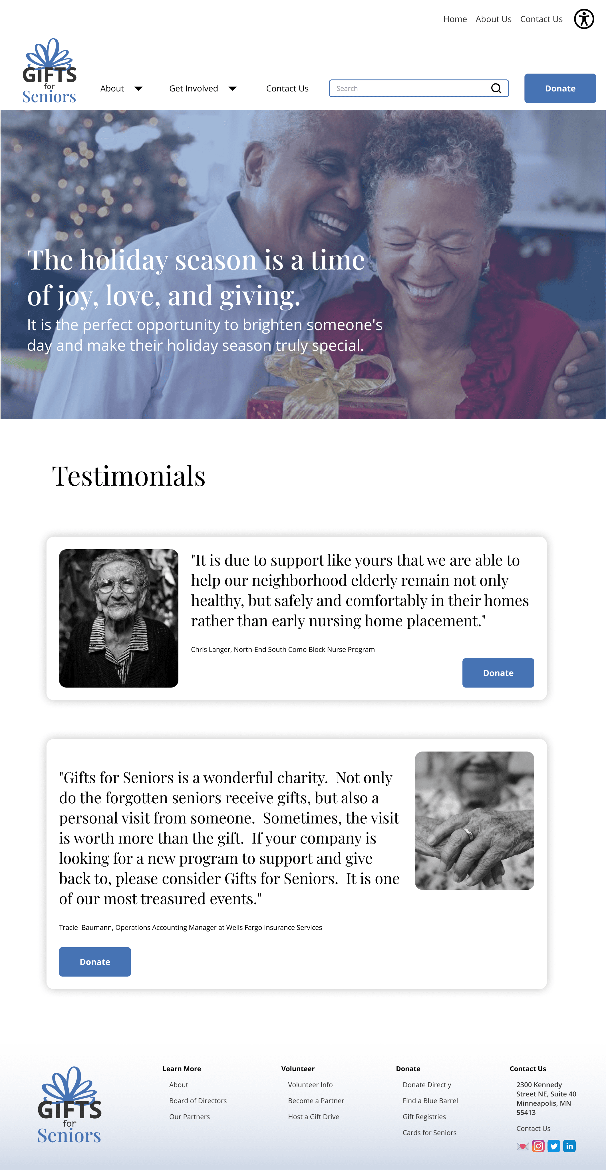
Before & After

Before

Hi-Fi Prototypes

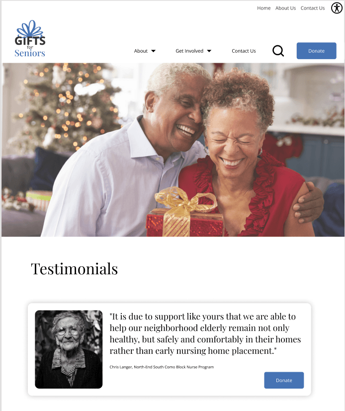
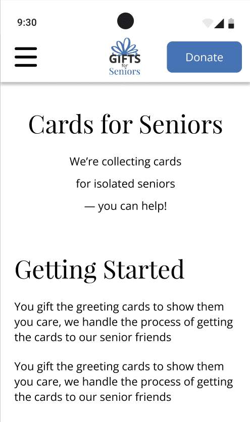
Based on our final iterations and implementing the Design System, I polished our High-Fi prototype and added interactivity to bring the prototype to life. I also ensured that the designs were responsive as this was a major callout from our preliminary Usability Testing.

Final Prototype

CONCLUSION

Stakeholder Alignment

After working directly with the Gifts for Seniors Executive Director in order to gain a better understanding of the business objectives and more accurately reflect the organization’s mission, I compiled a few reflections:


  • Current Mission: alleviating social isolation for seniors, helping them remain connected to the community, and identifying financial exploitation, abuse, and self neglect

  • Showing more of the WHY behind Gifts for Seniors on the website

  • Additional impactful offerings that are not currently on the website

  • Balance between having relevant information on the website, and having too much detail to constantly have to update

Final Thoughts


Categorizing ways to get involved (Donate vs. Volunteer) lowers the barrier to entry for new users

Connecting with users on a personal, emotional level allows them to gain trust in the organization and therefore increase involvement/conversions for the business


Not all nonprofits have the resources to take their websites to the next level - it is important to avoid scope creep and keep it feasible within the timeframe and budget of the project


  • Categorizing ways to get involved (Donate vs. Volunteer) lowers the barrier to entry for new users

  • Connecting with users on a personal, emotional level allows them to gain trust in the organization and therefore increase involvement/conversions for the business

  • Not all nonprofits have the resources to take their websites to the next level - it is important to avoid scope creep and keep it feasible within the timeframe and budget of the project


Next Steps

If I had more time to work with this non-profit, I would implement the following ideas:

QR Codes: allow users to instantly land on the donate page when scanning at live donation sites.

QR Codes: allow users to instantly land on the donate page when scanning at live donation sites.

Volunteer: integrate scheduling system into website and lean into more ways that people can easily can involved directly.

Volunteer: integrate scheduling system into website and lean into more ways that people can easily can involved directly.

Increase Accessibility & Interaction: Add searchable zip codes and interacting Maps to easily locate where users can donate.

Increase Accessibility & Interaction: Add searchable zip codes and interacting Maps to easily locate where users can donate.

View More Projects
Thanks for stopping by!

eliana.smelansky@gmail.com

2023 Eliana Smelansky • All Rights Reserved • Made with

Thanks for stopping by!

eliana.smelansky@gmail.com

2023 Eliana Smelansky • All Rights Reserved • Made with

Thanks for stopping by!

eliana.smelansky@gmail.com

2023 Eliana Smelansky • All Rights Reserved • Made with